NYC Data Science Academy
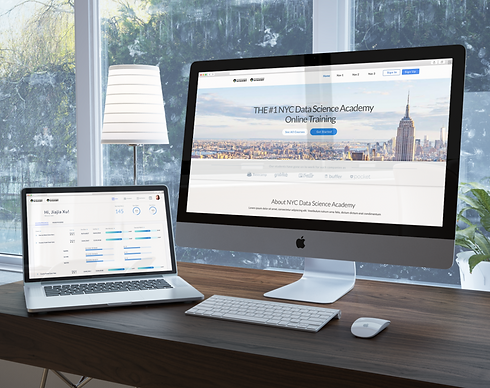
The project was to redesign an online education website. I focused on layout, visual themes, as well as to make it engaging so that it became more user-friendly. This was a very content heavy project as there were lots of different aspects of the website to consider.
My Role
UX designer, UX Reseacher and Visual Designer
Process

Competitive analysis
There were a few websites that I focused on for my competitive analysis. Our main target was General Assembly where I focused on the layout and the hierarchy of the content. I also took inspiration from Codecademy and Khan Academy for navigational solutions as well as the general look and feel of the websites to try and incorporate their online aspect into the project.
User Interviews
It was my job as the UX researcher to set up user interviews, as well as getting the marketing and the developers opinions along with implementing their own research findings.
I spent a lot of time talking with users to understand what their needs were and the features that they wanted. It was important to be a good tiebreaker between marketing and developer opinions since I had the users feedback.
Usability testing
There were two rounds of usability testing, both were very important.
The first round was with the wireframes to get feedback and to make sure the users could understand the layout and terminology, as well as get a general feel for the site so they could give us basic opinions.
The second round of testing was after the project had gone through production to understand the interactions better and get feedback from visual elements.
Wireframes
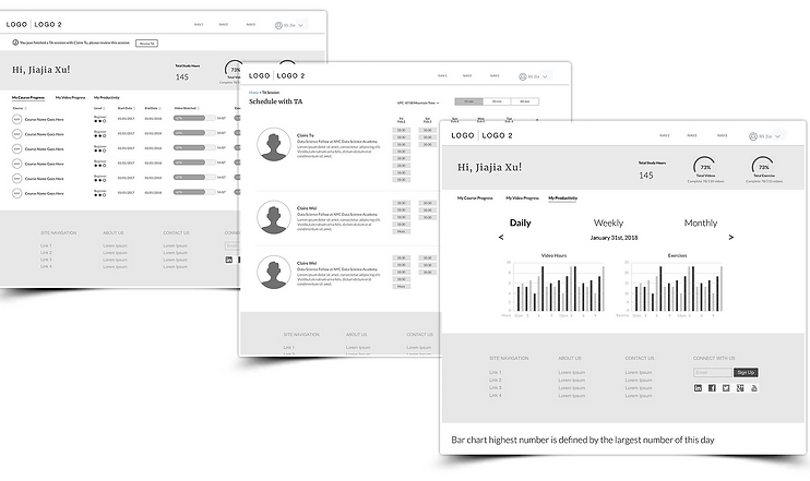
I created wireframes for desktop and tablet screens. Through the wireframes I was able to design user flows, navigation, and interactions. The wireframes were annotation for clarity and technical details.

Wireframes for Website

Wireframes for Student Dashboard
User Testing
Equipped with my initial design, I took to the streets to do some field research. I visited the school and interviewed three students. I asked questions about their current online study process and watched them carry out common tasks. We spoke about their priorities and frustrations throughout their experience and afterwards, I showed them my current design ideas to get their feedback.
The knowledge I gained from these interviews were priceless, changing my focus from the application's visual design to its functionality.
Challenge 1
Users found the following elements problematic
While watching the education videos and doing the exercises at the same time, Students would have to scroll up and down between the video and their work environment to complete their tasks.
Solution: Changed scrolling to a toggle for quicker interaction.
Scrolling was not user friendly in this situation, so I found that clicking was a much more efficient solution. I added a toggle at the top of the video that switched between the video and the work environment. Scrolling took about three-four seconds, whereas clicking on the toggle was less than a second. During the testing, I found that students had to toggle around 50 times per video.
Challenge 2
Users had a lot of content to track
The training hours are really long and some of them come with 100s of exercises so students found it hard to check and keep track of their progress. The corporate purchase their classes as a group, the manager wants to be able to check on the progress of their employees.
Solution: Simplified the dashboard into three kinds of trackers.
I managed to break down all of the students content into three different categories that I used to help separate all of their workloads. Firstly, they are able to check their overall accomplishments. Secondly, they can track their individual progress for each course and even their chapters. Lastly, they are able to track how much work they have done today, this week, and this month.
User-Centered Design
Provided different options to clients and also tested them to find the best option.


By the end, I was able to deliver the visual designs along with annotations for the specs of the layout. I was able to help with the front end development because I have knowledge of HTML coding.

